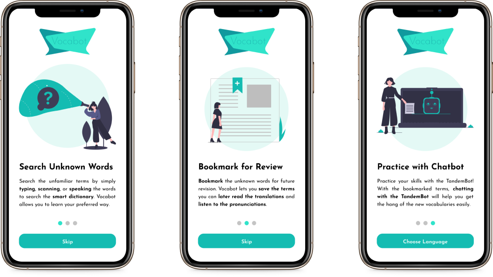
Vocabot: Onboarding Screens
The Overview
Background
Problem
Solution
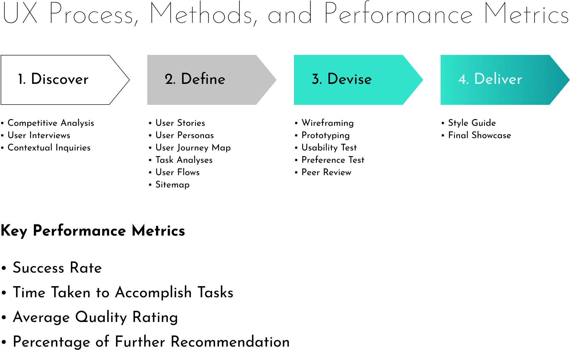
Design Process, Design Methods, and UX Metrics used

Design tools used
The Process
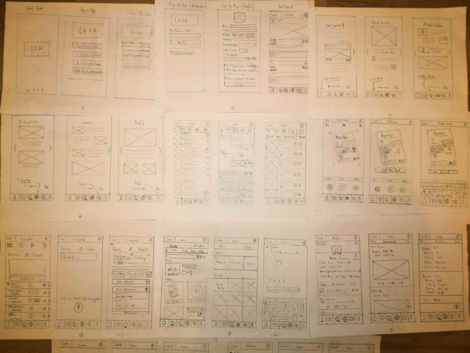
Paper Wireframes: Vocabot
1. Discover
Investigating the Status Quo
Competitive Analysis
I conducted the Competitive Analysis to find out what the market looks like for the language learning app as well as how each of those apps work. I picked Duolingo, Memrise, Babbel, and Basuu because they are all well known apps and have positive reviews in the App Store and Play Store.
Duolingo made gamification along with clean and user friendly UI design more engaging for the users to commit to learning languages with the app. However, the reset of streaks could be discouraging. Also, some correct answers are not recognised by the app made learning less efficient. With Memrise, users can jumpstart their level and the learning materials are quite flexible. On the other hand, advertising for Pro package can be perceived as 'too hard' selling method.
Babbel has a very beautiful UI design with supports for essential language skills for users, but users had to answer survey on personal questions too early in the stage. Busuu helps user make study plan that fits their schedule. However, all learning levels ends at B2.
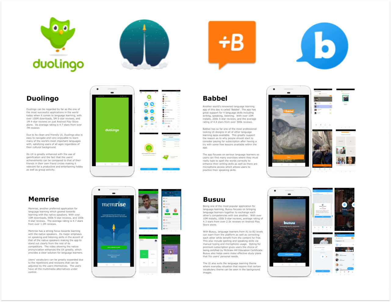
Competitive Analysis: Duolingo, Memrise, Babbel, Busuu
User Interviews
I interviewed 3 people age between 20 - 42 to evaluate the demand for the app and explore how potential users normally learn a language. I also took note of any non-verbal cues picked up during the session.
The result revealed the following:
- 3 out of 3 participants cited the reason for attending traditional language class because they find regular use of language the most helpful way to learn a language.
- 1 of them finds flashcard app not helpful because 'it felt unnatural to learn by memorisation'.
- 1 of them finds screenshots from phones and flashcards helpful.
- 2 of them regularly use app like Google Translate and DeepL to learn the language from practical use.
- All of them felt 2 way-communication a neccessity to be able to learn the language more effectively and efficiently.

User Interview: Language Learning Methodologies
Contextual Inquiries
I spent 2 more deays observing the behaviour of 34 students in their German language classes at various levels. I also took notes from my observations to see how they reacted to not understanding unfamiliar words, or phrases they came across in various situations. It turns out that many of them resorted to apps like Google Translate, DeepL or Leo Dict for situational remedies. No photo, video, or audio recording was allowed.
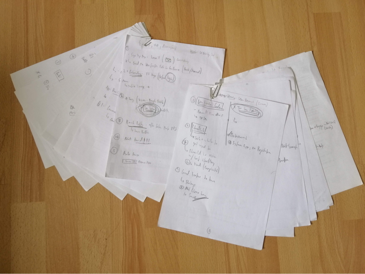
Contextual Inquiries: German Language Class at a local non-profit
2. Define
Developing the Core Experience
User Personas
I initially came up with 3 Personas, but since they all resemble to a common trait of being foreigners trying to learn a language, while either working, studying, or seeking asylum in order to adapt to the new environment. I decided to stick to this Ladda persona, the new girl who seek to learn German while adapting to her new life in Germany.
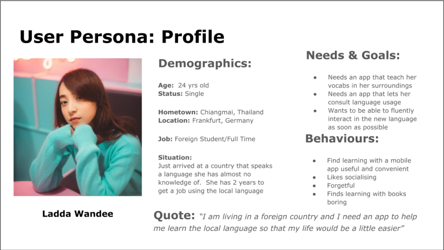
User Personas
User Stories & Job Stories
I developed User Stories & Job Stories so I can map out the scenarios for the app I'm designing for. The information is based on what has obtained from the previous phase of my design process - 1. Discover and the User Persona finalised.
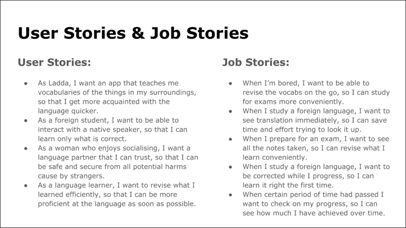
User Stories & Job Stories
User Journey Maps
I created the User Journey Maps based on the personas developed in order to simulate how Ladda would feel as she goes about trying to use the app.
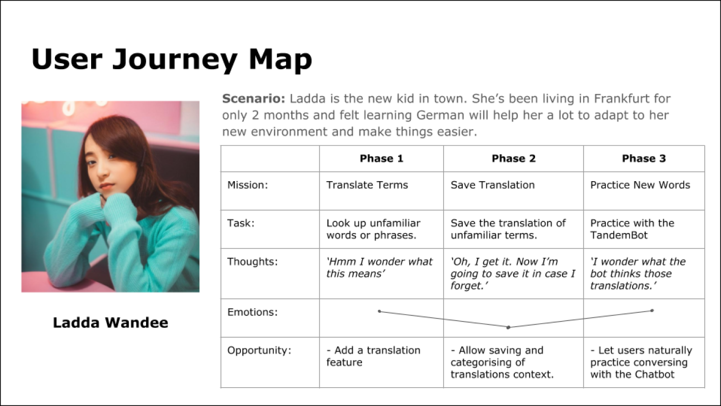
User Journey Map
Task Analyses & User Flows
I created the Task Analyses and User Flows based on the user persona and the journey map developed to work out the steps needed to be taken in order to accomplish the tasks in the given scenarios.
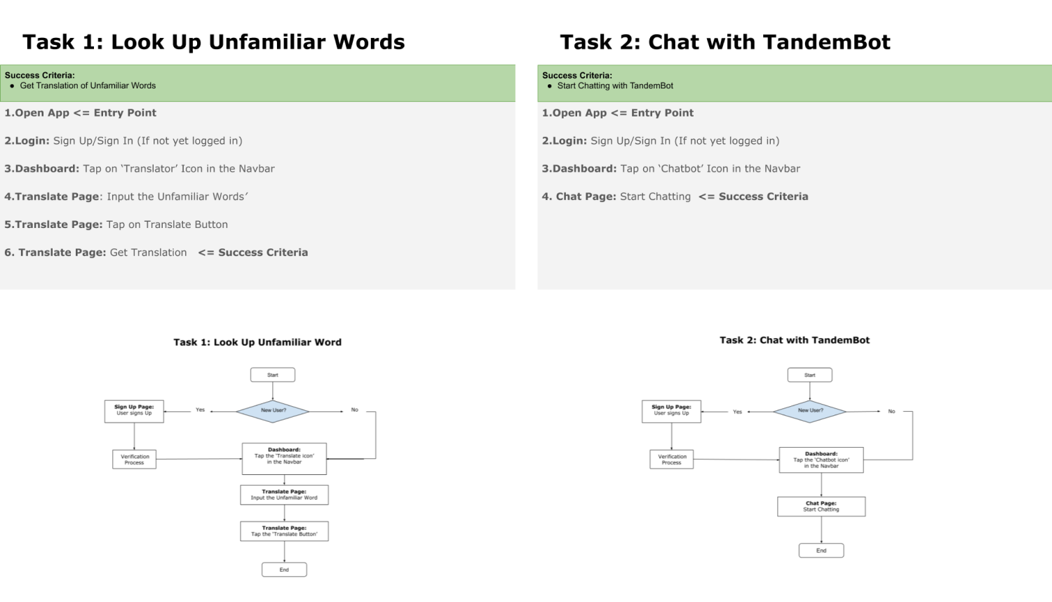
Task Analysis & User Flows
Sitemapping & Cardsorting
I made the Sitemap so I know every single pages that are needed to complete the entire app. I compile the sitemap based upon the steps worked out in the task analyses.

Vocabot Sitemap Ver.2
3. Devise
Developing the Flow of Look & Feel
Wireframing & Protyping
I initially sketched out the ideas on papers to create Paper Wireframes in order to make sure the UI design generally made sense based on the finalised sitemap. I then combined them into Low-Fidelity Prototypes to make sure the user flows really made sense. Once done, I created the digital version of the Low-Fidelity Prototype with Balsamiq to start fiddle around with different ways I could placed the UI elements.
When I'm sure where about those UI elements shall be placed, I started creating the Mid-Fidelity Prototypes in order to emphasize more on the details where I experimented fonts and modals.
I finally created the High-Fidelity Protype in order to expriment with colours and illustrations, thereby getting them ready for the usability test.
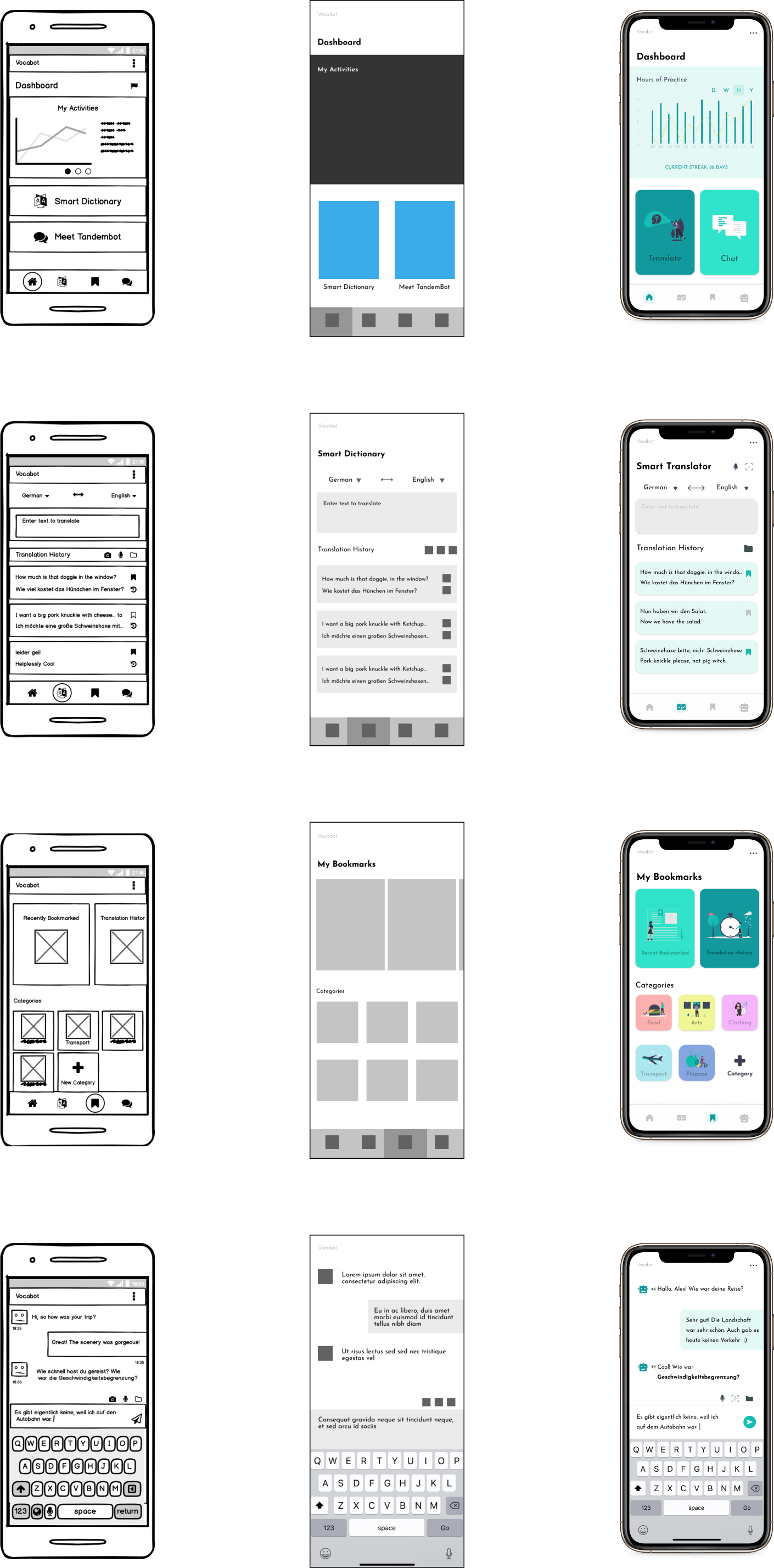
Wireframes & Prototypes
Usability Test
I conducted 1 round of Moderated Remote Usability Test. There were 6 participants age between 27 - 44 and 4 tasks were attempted by each of the participant. The results revealed the following:
- 6 out of 6 Participants generally found the app straightforward and intuitive to use
- 1 out of 6 Participants had problem trying to auto-complete the form, and requested that the hint be displayed more clearly
- 6 out of 6 Participants mentioned that they love the colour scheme and the illustrations
- 5 People said the Bookmark process and the Chat Console were very intuitive looking.
- 4 Participants completed every task in 20 seconds.
- Main problems idenfied were that the chatbot icon was usually mistaken for a calendar icon, the scan icon couldn't be recognised by most participants. Also, most participants showed slight sign of hesitation while trying to input the unfamiliar terms.
I attempted to resolve the usability issues found during the Usability Test by taking the following actions:
- I took note of all the single usability issues notified by the participants.
- I then groupped the issues together and summarised them using Affinity Map.
- I discected each issue in the Rainbow Sheet to gain more insights into the details of each issue.
- I analyse each issue found and decide which issues to solve as well as the way to solve them because some solutions could solve more than just 1 issue
- I finally implemented the changes as appropriate.
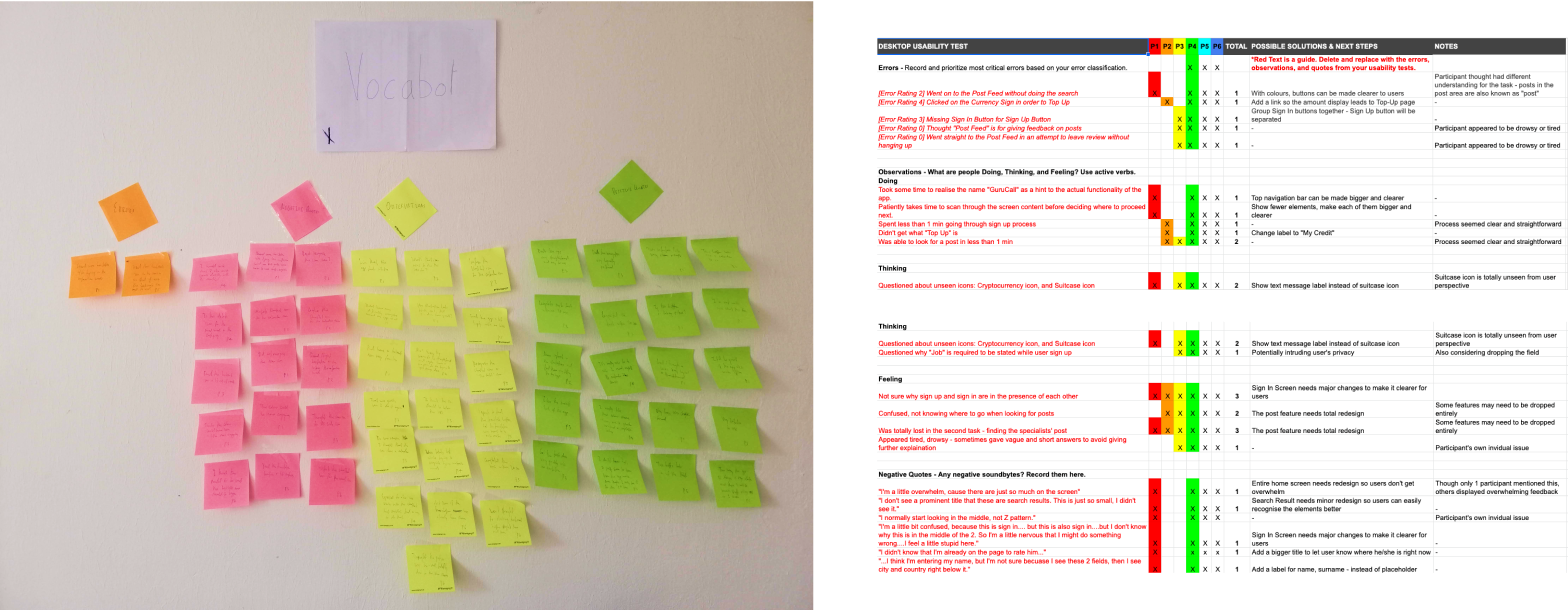
Usability Test Analysis: Affinity Map & Rainbow Sheet
Preference Test
I conducted a total of 3 rounds of Preference Test using Usability Hub to find the most desirable blend of design preferred by the potential users. The 3 pairs of the screens in different design versions were involved.
Most respondents preferred a slightly more blue background than clean white background.

Preference Test Results
Peer Review
I conducted a peer review of my design in order to collect comments on my design. The participants were all UX/UI Design students at CareerFoundry. I believed their feedback have been insightful, supportive, and credible.
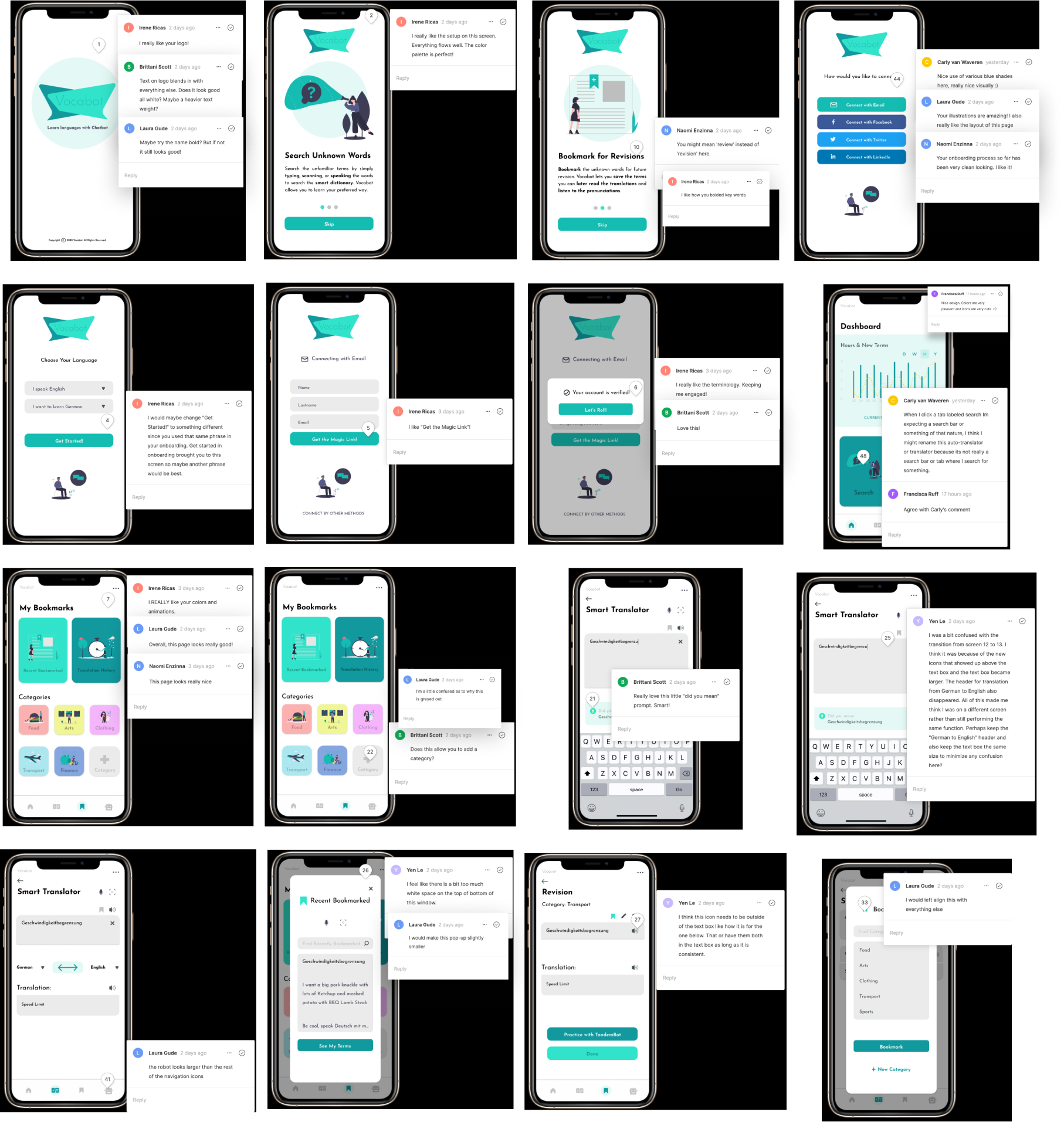
Peer Review
4. Deliver
Presenting the Outcome
Style Guide
I created the style guide to conclude my UI design elements. The document lists all the styles and esigns being used for this app, including typography, colour palette, UI elements and icons.
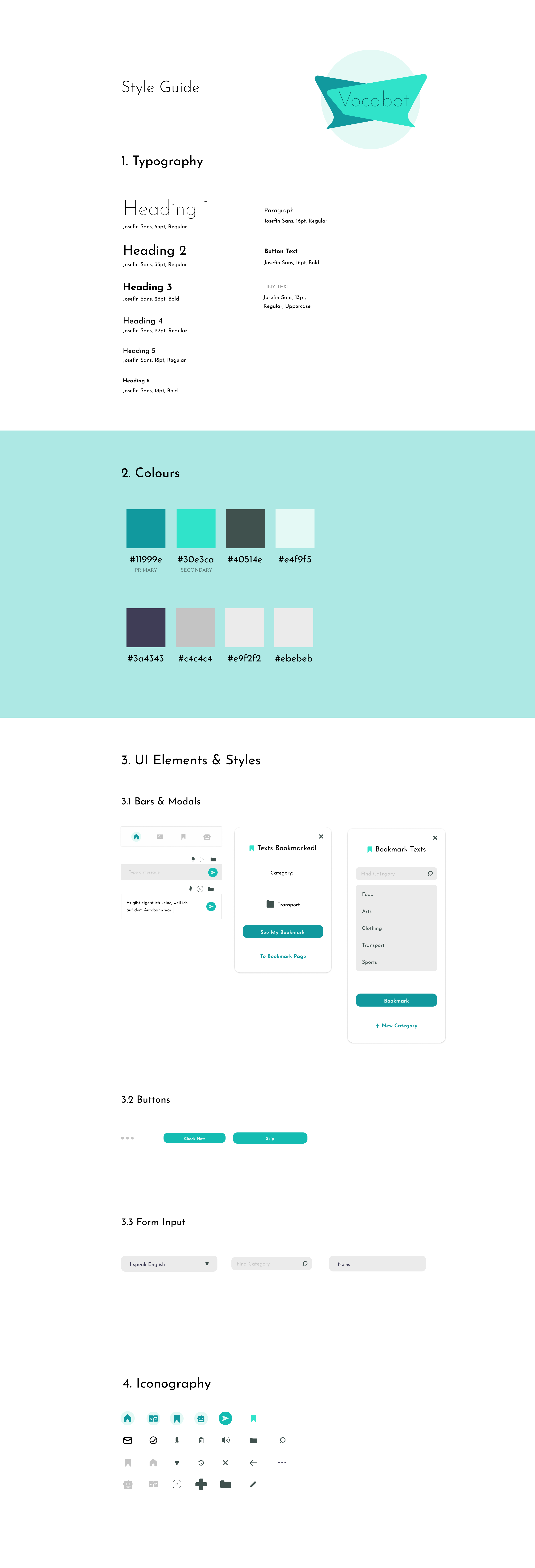
Style Guide
Final Showcase
I finalised the design of the app in the following showcase. I believe that this app has been successfully designed not only because the texts and buttons being stragically placed in order to help users find them easily whenever they need, but also the shapes, colours schemes, and illustrations do harmonously portrait minimalistic look

Final Showcase: Vocabot
The Result
Interactive Prototype
Usability Measurements
Usability Metrics
- Success Rate: 100%
- Average time taken to complete each task: ~17.875 sec.
- 100% of the participants would recommend the app
- Average Quality Rating: 5.175/6
Process Reflection
What went well
The User Interview and Contextual Inquries went very well because I have taken the time to understand the problem and establish reserch goals to really find out from the study. As a result, User Personas, User Journey Mapping, Task Analyses, User Flows, and Sitemapping went very smoothly. Also, I had a lot of fun coming with with ideas for the Preference Tests and Peer Review due to the insights I was able to extract from what the respondents were really trying to communicate.
What didn't go well
The Contextual Inquiries could have been less bumpy if some kind of recording like video, audio, or photo was allowed during the session. However, due to the privacy concern and difficulties having to obtain proper consent, I had to take notes on papers to keep things simple and save time.
What to improve
While many people told me I have chosen my colour palette well, I believe that the font pairing could have been a bit better. If I have more time, I would also test more screens like settings and payment options.
What I learned
The potential of AI technology is very promising given the fact that Chatbot on the web, and phones answering automation has now become the norm. For this project, not only participants find AI a great help to efficiently make learning languages easier, Chatbot itself also makes learning feels more intuitive because people do chat everyday on their phones.
Additionally, having tested the ideas about TandemBot made me also realised that not only it keeps users' information safe, the users also don't have to worry about being physically harmed or verbally abused by other abusive users.
What to do next
The project is now ready to be passed on to the developers so that the app can be developed for real world usage. It will also be neccessary to conduct pilot tests so the bugs can be removed before the official released. The should take 1 - 3 months, depending on time constraints, budget, and team size, the project can be expected to be launched.
The next important phase to constantly improve the user experience via analytical tracking. This way, we can detect other problems that have not been discovered during the initial design process.
