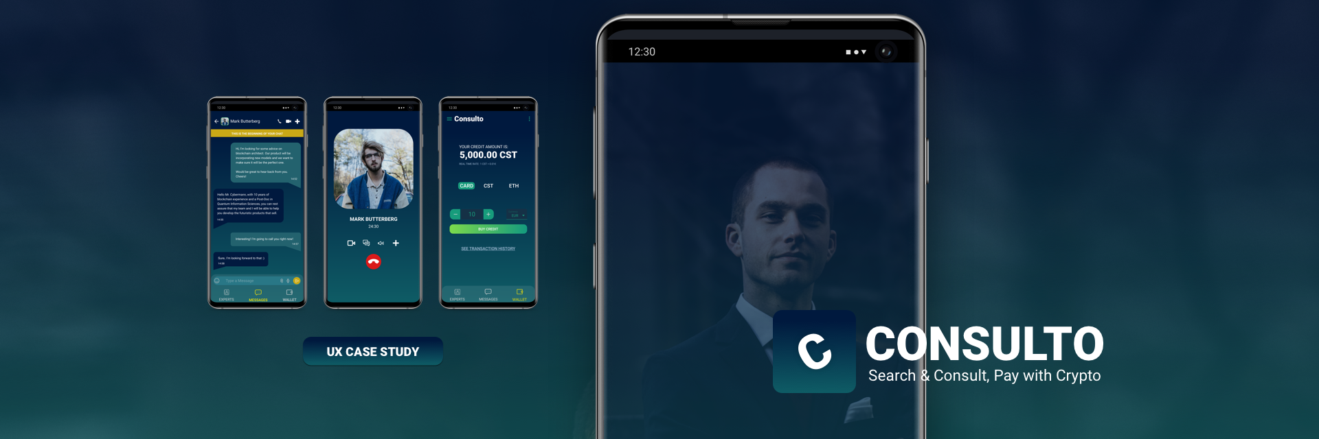
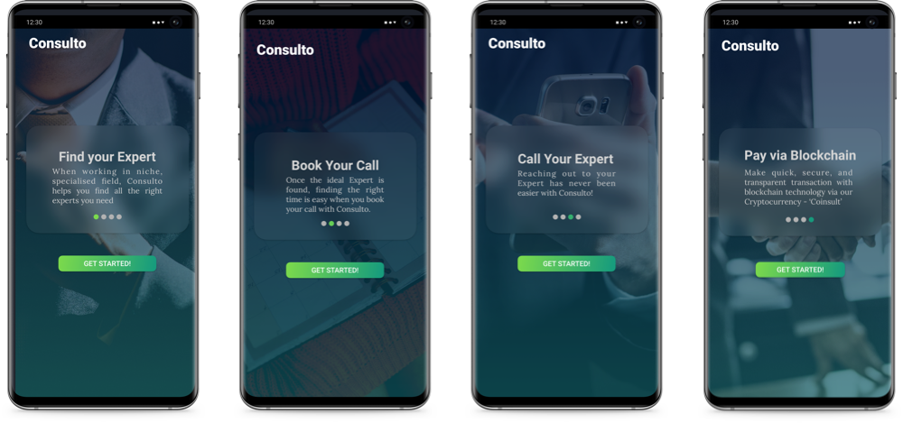
Consulto: Onboarding Screens
The Overview
Background
Problem
Solution
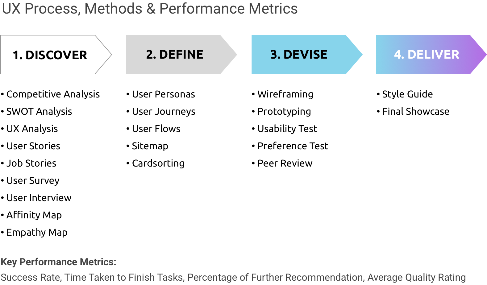
Design Process, Design Methods, and UX Metrics used
Design tools used
The Process
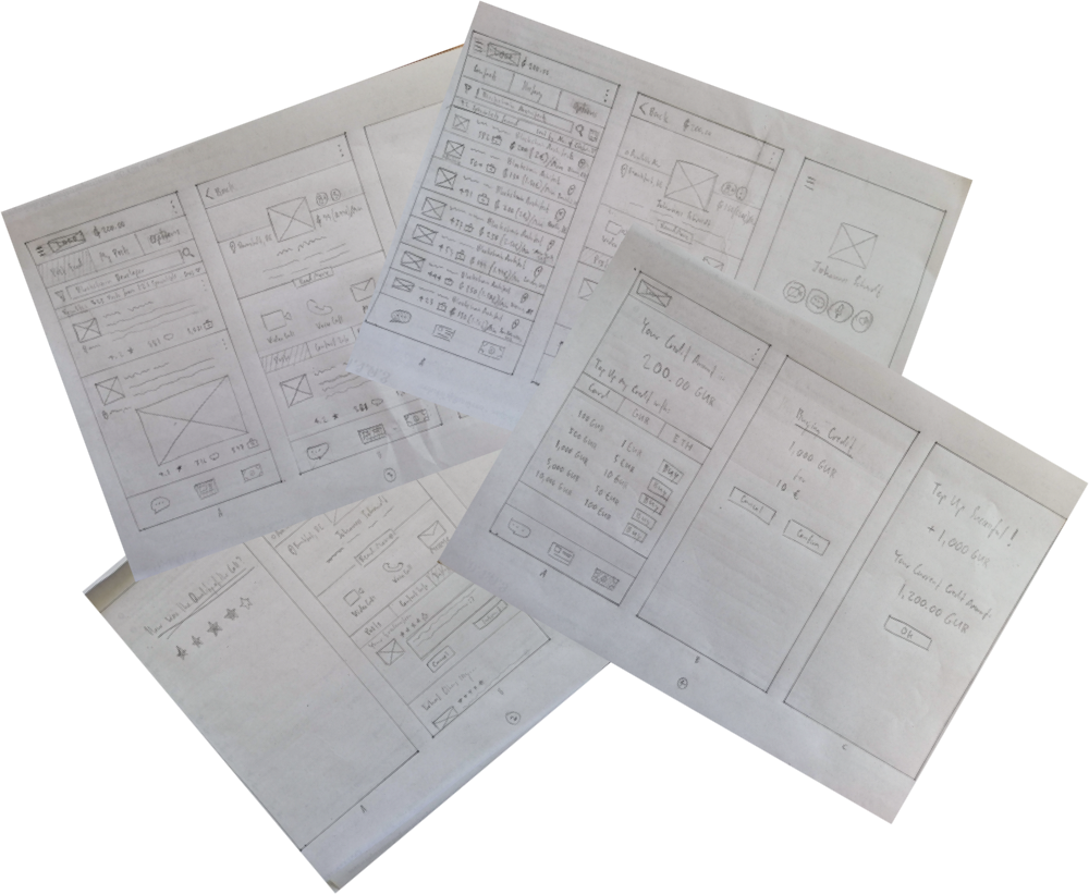
Paper Wireframes: Consulto
1. Discover
Investigating the Status Quo
Competitive Analysis
I investigated the market in order to see what similar solutions were already available. I found a number of apps but 2 were particularly interesting, namely 'Experty' and 'The ONE'.
I conducted an in-depth competitor analysis on both Experty and The ONE to learn more of the backgrounds and the logic behind the business models. I found that Experty has a very solid business model hence, the idea is very business viable.
Experty positions itself as the consultation platform for B2B market. The ONE targets younger people who want to learn new skills. Businesses generally have more purchasing power, therefore Experty's model seemed to make much more sense.
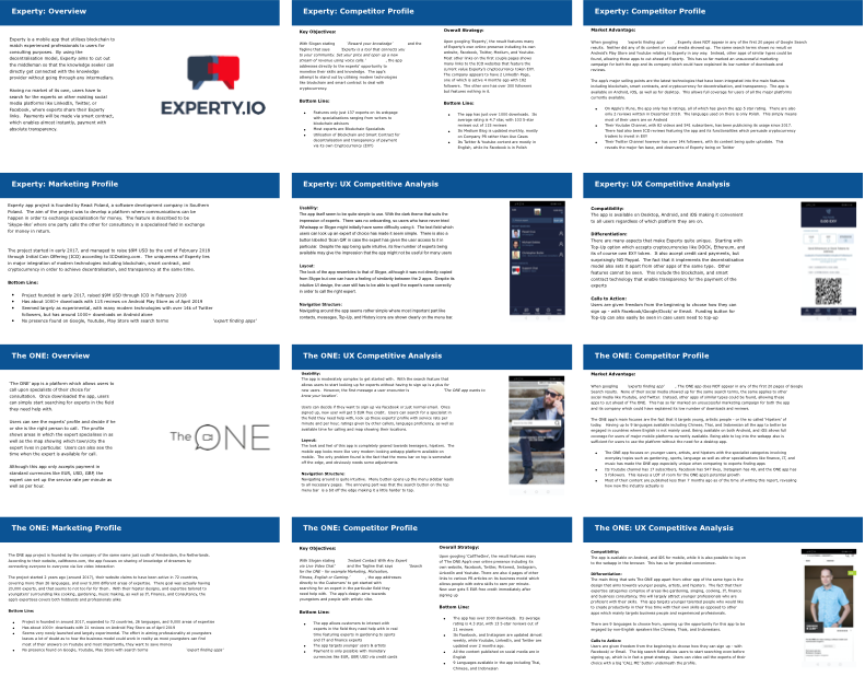
Competitive Analysis: Experty vs. The ONE
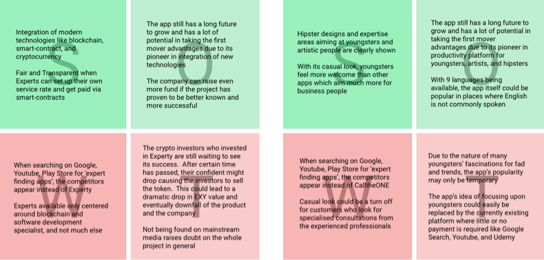
SWOT Analysis
I conducted the SWOT Analysis to assess the market situation of both Experty and The ONE.
Experty does a great job at 'blockchainicating' the transaction with 'smart-contracts' to ensure transparency. Experts can also set their own rates. However, Experty itself seems to be having clusters of blockchain specialists availble and not much else. It also needs a lot of improvement in Search Engine Ranking and findablity.
The ONE targets younger people who want to be more productive. The appearance gears towards young entrepreneur and mentorship with hipster design. It also has problem with Search Engine Rankings. With its customer having lesser purchasing power than Experty, and hipster appearance might not make it look so professional to some customers with higher purchasing power.
SWOT Analysis: Experty vs. The ONE
UX Competitve Analysis
I conducted UX Competitive Analysis to assess the user experience of both Experty and The ONE app from the perspective of a user.
Experty has dark theme with no onboarding screens. QR code made searching expert simpler when both parties physically meet. Navigating through the app feels quite logical and intuitive. With its own cryptocurrency, EXY, the app is well differentiatedfrom other competitors while offering credit card as an alternative payment method.
The ONE app has a very hipster, young and creative look and feel. It allows user to start searching for experts without the need for signing up. However, the app asks the access for user's current location the first thing. Navigating around feels intuitve. The top bar is somewhat off the edge, making it hard to tap on the search button. The app also is accessible with 9 languages. Users can also sign up via social media.
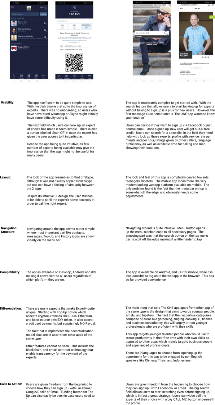
UX Analysis: Experty vs. The ONE
User Stories & Job Stories
I developed User Stories & Job Stories from the compilation of findings in order to summarise the use cases of the type of app I am designing for.
Potential users range from businesses that seek proper business consultation to make proper business desicions to youngsters seeking to be more productive in life. I listed experience of new users and existing users in form of user stories to note potential pain of having to sign up and distinguish important features like Contact, Messaging, and Wallet. I also wrote job stories to map the context of use for various potential users backgrounds and life styles.
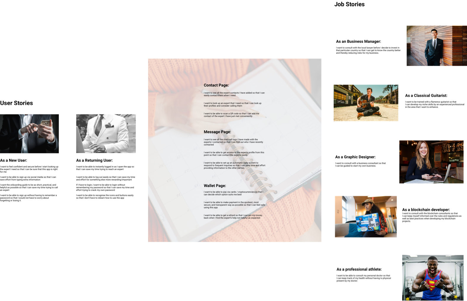
User Stories & Job Stories
User Interview
I interviewed 5 people aged between 20 - 42 to evaluate the need for the project and check on the business viability. I noted the responses from the participants' verbal reply and non-verbal cues captured from the session.
The result revealed the following:
- 5 out of 5 participants experienced the need to consult experts at some point both at work and at home. In most situations, unprepared.
- 1 of them find using technology to consult somewhat tiresome and prefers to use address book and telephone due to familiarity and frequent travel to and from home country.
- 4 of them mentioned difficulties in finding the right experts because they couldn't tell which experts really know their cases better than the other experts.
- 2 of them mentioned that too many information available made search more complicated.
- 2 of them were not skillful in using mobile apps.
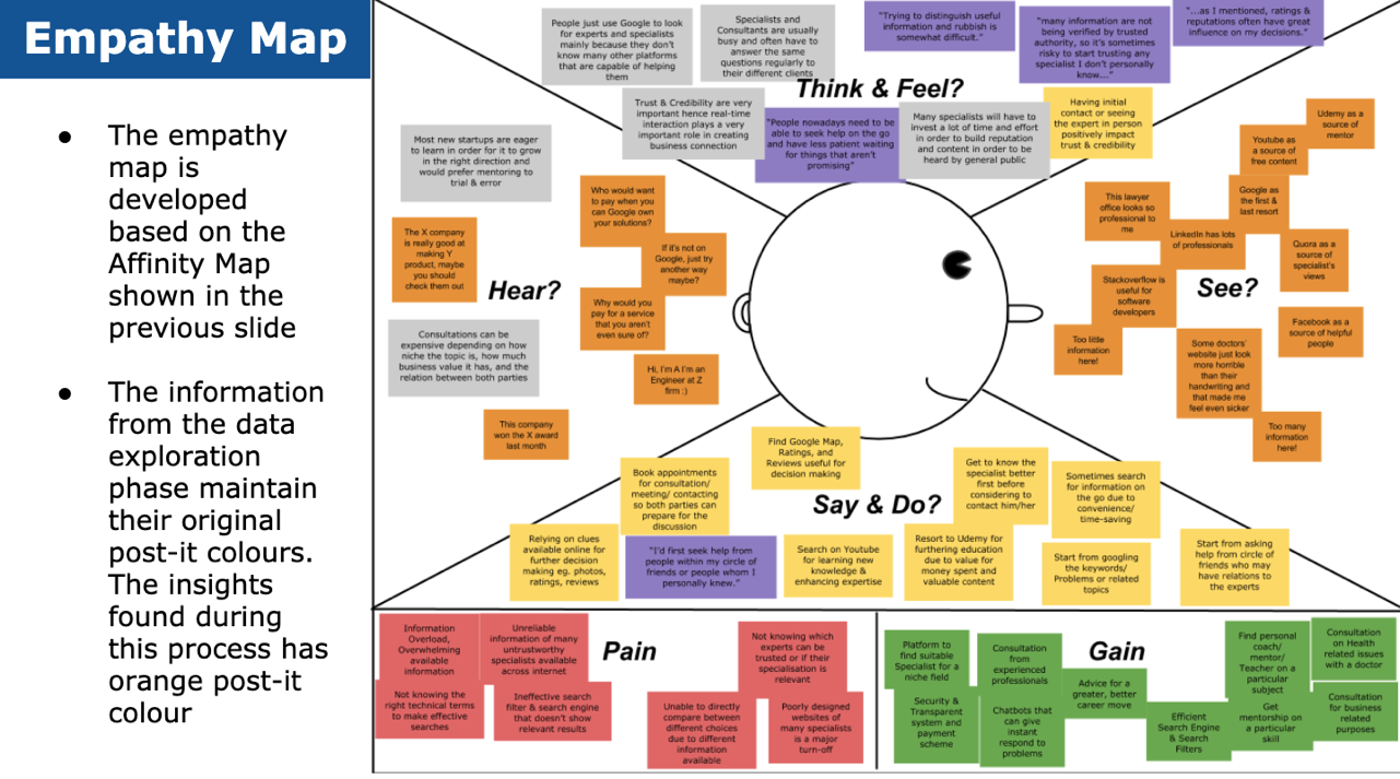
User Research: Empathy Map
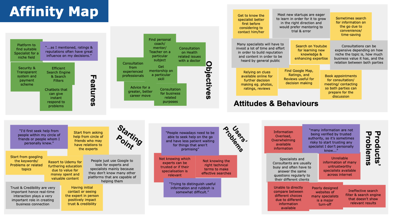
User Research: Affinity Map
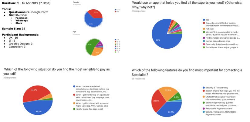
User Survey
I conducted User Survey to find out what the potential users think of the solution on a larger scale. The period spanned over 7 days with a total of 35 responses.
The insights are as follows:
- 80% of the respondents would definitely use the app to find the experts they need
- 47.4% of them wold pay to use the solution for business related purposes
- 44.7% of them would pay to get personal mentorship
- 37.1% finds security and transparency the first priority to have when contacting specialists
- 28.6% said the search engine's quality is the most important.
User Research: Survey Results & Analysis
2. Define
Developing the Core Experience
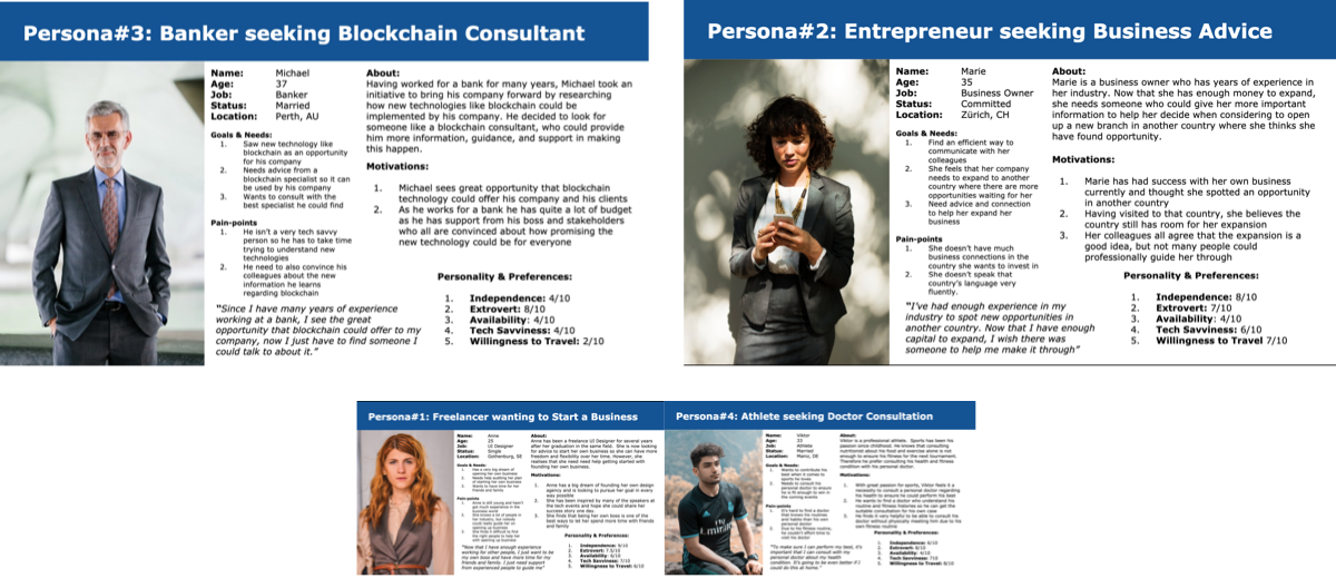
User Personas
4 Groups of User Personas have been finalised:
- Freelancers trying to Start a Business
- Entrepreneur seeking Business Advice
- Employees searching for Niche Consultation
- Youngsters seeking Doctor Consultation
2 Primary Personas: Michael the Banker, and Marie the Entrepreneur have been selected. If I make user of these personas happy, I will be able to satisfy other personas I finalised as well. Most users are expected to be working larger firms or self-employed respoectively. The decision is based on the background research of the participants.
User Personas
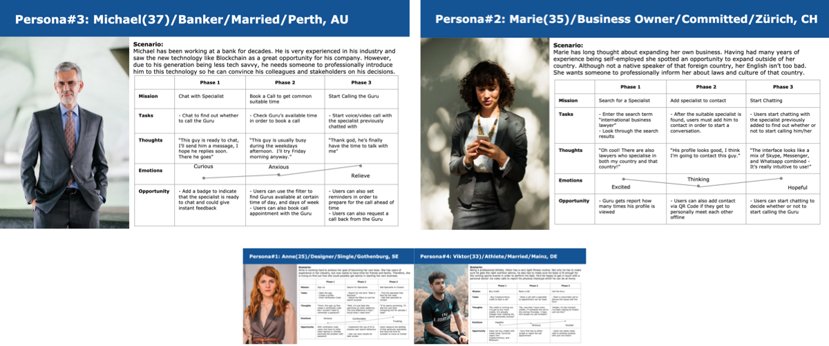
User Journey Maps
I created the User Journey Maps based on the personas developed in order to gain insights into the activities they would be going through as they use the app.
User Journey Maps
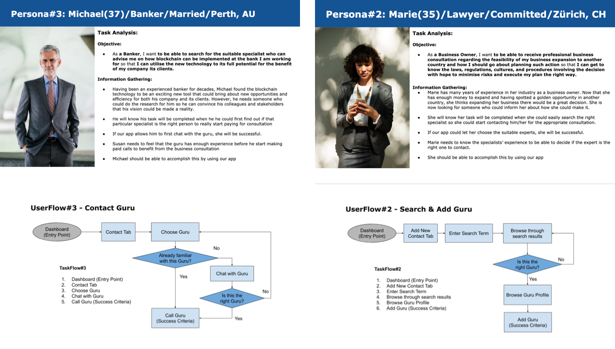
Task Analyses & User Flows
I created the Task Analyses and User Flows based on the journey maps developed to map out the steps they have to go through as they try to accomplish the tasks while using the app.
Task Analysis & User Flows
Sitemapping & Cardsorting
I drafted out the sitemap in relation to the task analysis to put together the features into 1 single app. I also conducted a cardsorting session which 16 people took part in order to make sure the categories were correctly named and audit the screen flows. I also corrected the sitemap according to the cardsorting result.
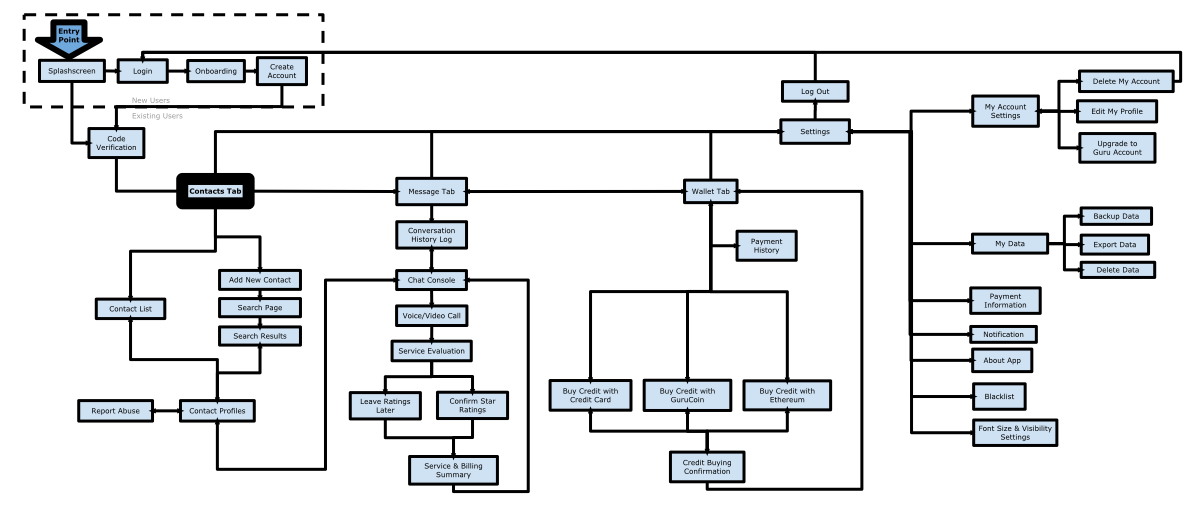
Consulto Sitemap Ver.3
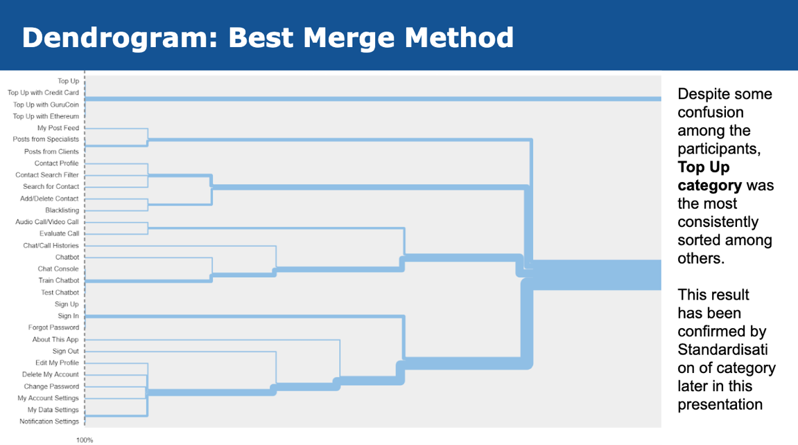
Cardsorting: Dentogram
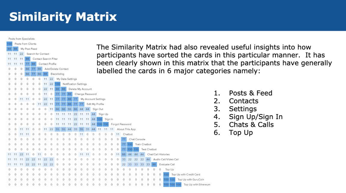
Cardsorting: Similarity Matrix
3. Devise
Developing the Flow of Look & Feel
Wireframing & Protyping
I first sketched out the ideas on papers to create low-fidelity wireframes. I drafted the mid-fidelity wireframes when I am sure I have all the important aspects to see how the design would look, using Balsamiq. I fiddled around with many design options before I finalised the best version for the usability test with the high-fidelity wireframes using Sketch and created the prototype using Invision.
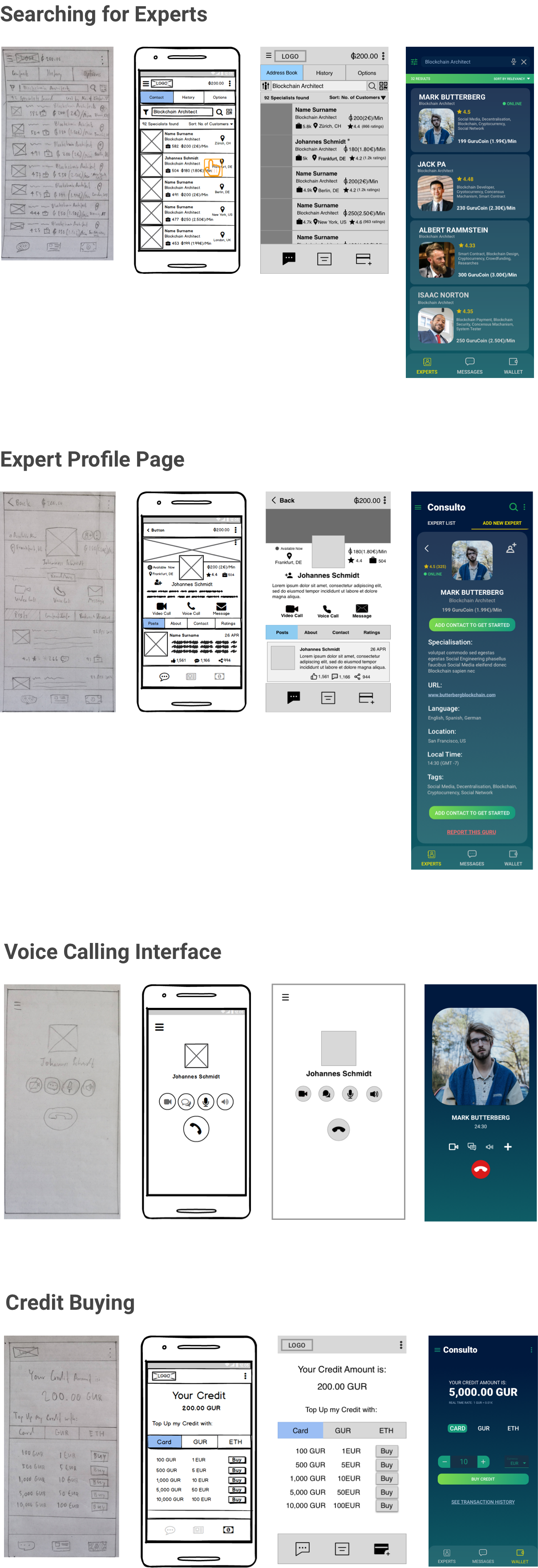
Wireframes & Prototypes
Usability Test
I conducted 1 round of Moderated Remote Usability Test. There were 6 participants age between 20 - 49. There were 4 tasks. The results revealed the following:
- 3 out of 6 Participants found the app very straightforward
- Main problems idenfied were perception of icons that were meant to replace text labels and terminology usage problem. For example, the suitcase icon was meant to show number of projects, and 'Top-Up' is a British phrase meaning 'to refill mobile credit', which isn't used in the US.
- 2 participants said they find too many elements on the profile page and were overwhelmed while trying to attempt the task, particularly in the Profile Page
- 4 People said the app was intuitive and not hard to navigate around
- 6 Participants found the app concept logical and interesting due to the implementation new technology like blockchain.
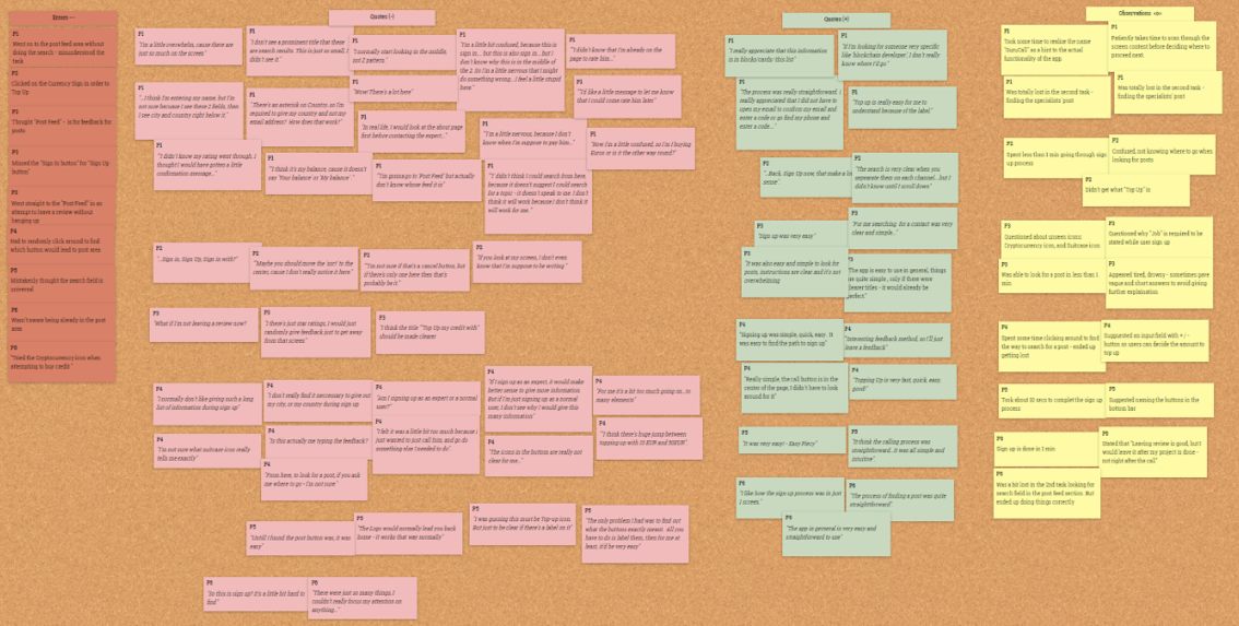
I attempted to resolve the usability issues found during the Usability Test by taking the following actions:
- I took note of all the single usability issues notified by the participants.
- I then groupped the issues together and summarised them using Affinity Map.
- I discected each issue in the Rainbow Sheet to gain more insights into the details of each issue.
- I analyse each issue found and decide which issues to solve as well as the way to solve them
- I finally implemented the changes as appropriate.
Usability Test Results
Rainbow Sheet
Preference Test
I conducted a total of 12 rounds of Preference Test using Usability Hub to find the most desirable blend of colours preferred by the potential users. The 12 pairs of the same screens in different design versions were involved.
Most respondents preferred the contrast of blue-green gradients. Some also liked the simple design with no gradients, but far fewer.
Preference Test Results
Peer Review
I conducted a peer review of my design in order to collect comments on my design. The participants were all UX/UI Design students at CareerFoundry. I believed their feedback have been insightful, supportive, and credible.
I also found out that some people's screens show subtle differences due to their monitor qualities and graphic cards. I made sure the accessibility issues are solved. Many of them said they liked the app concept and found the flow intuitive.
Peer Review
4. Deliver
Presenting the Outcome
Style Guide
I created the style guide to conclude my UI design elements. The document lists all the styles and designs being used for this app, including typography, colour palette, UI elements and icons.
Style Guide
Final Showcase
I finalised the design of the app in the following showcase. I believe that this app has been successfully designed not only because the texts and buttons being stragically placed in order to help users find them easily whenever they need, but also the shapes, colours schemes, and images do portrait the business look and feel perfectly.
Final Showcase
The Result
Interactive Prototype
Usability Measurements
Usability Metrics
- Success Rate: 83.33%
- Average time taken to complete each task: ~1.10min
- 83.33% of the participants would recommend the app
- Average Quality Rating: 4.2/5
Process Reflection
What went well
The competitive analysis, user-flow, preference test, and peer review went very well. I was very surprise to find out that Experty, at the time of the study, the only startup that utilises blockchain for this type of app. The user-flow went well due to the detailed insight the participants gave during the user interview. The preference tests and peer review sessions also went well due to support I got from fellow designer students at Career Foundry.
What didn't go well
I found it challenging to scope down to target certain persona due to the business model being very widely applicable to many industries. This created many possibilities for user stories to be developed. Also the time constraints that was pressuring me to finalise the main personas. I solved the problem by conducting User Interviews and User Surveys to see how potential users think. This led me to decide on focusing the business context.
When I had to plan for the usability test, I had to reschedule my plan for the weeks to come because some participants were not based in my time zone. This meant I had to do outside my usual work hours like 9PM or 8AM.
What to improve
I could have planned the define phase a little better. If I spend more time making moodboards, and think less about making the perfect design, I would have made my design less complex and thus better UX during the usability test sessions.
What I learned
I find the use of blockchain technology very interesting and how promising the technology actually is in the coming decades. I also believe that UX Design for blockchain-related products will be an important role in the near future.
The growth opportunity for blockchain technology product is massive, but this will also depend on the 'Adoption Rate' amongst the users. We all can expect to see blockchain usage as the norm within the coming decades.
What to do next
The project is now ready to be passed on to the developers so that the app can be developed for real world usage. It will also be neccessary to conduct pilot tests so the bugs can be removed before the official released. The should take 1 - 3 months, depending on time constraints, budget, and team size, the project can be expected to be launched.
The next important phase to constantly improve the user experience via analytical tracking. This way, we can detect other problems that have not been discovered during the initial design process.